Stendhal:Tileset specifications
Any new map graphics should comply with these specifications.[1] (Yes, there are several old images that do not comply; Those will be fixed eventually).
General
The tilesets used for the maps are in tiled/tileset directory in the stendhal source. Give your image a descriptive name in lowercase letter and use underscore between words. You don't need to repeat information in the image name that's already given by the directory name. The current directory hierarchy is here.
- The license must be GPL, or compatible, such as CC BY, CC BY-SA, OGA BY, CC0, and public domain.
- Tile size is 32x32 pixels. Therefore, the dimensions of all tilesets must be some multiple of 32.
- File format is PNG, 8 bits/color.
- If the images have more than 256 colors, or include semi-transparent pixels, it is best to preserve them in RGB colorspace. Otherwise, converting the images to indexed color will reduce file size & help keep the client download smaller.
- Include the original layered version of the file, preferably as xcf.bz2, which GIMP supports.
- An alternative to GIMP is Krita, though not as widely used in the project.
- The client drops from full translucency to fully opaque and fully transparent pixels on slower systems. Using translucency is allowed, but the images must look passable with bitmask transparency too. It is possible to test the effect in the client, by choosing the desired transparency mode in the visual settings.
- unlike items, tile images do not use border lines
Perspective
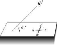
The object is to appear as viewed directly from the south, at a 45 degree angle to the ground plane. There's no distance effect. Interiors walls are an exception to this.

The effect of the view angle is that lengths in north-south direction are scaled by 1/√2 (≈0.71). Likewise for all heights. Example of scaling north-south length in the well.
Interior walls
Interior walls are viewed directly from above, and with faked distance effect. See the current wall images for examples.
Currently, there is a mixture of styled interior walls. A format should eventually be decided upon & all tilesets/maps converted.
Light
Light comes slightly from the left (roughly south south west), and above of the viewer.
Because semitransparent pixels can not be used, shadows outside the main shape of the image must be done with opaque color. RGB color #353535 is fairly common, but you can use something else too.
Adding tiles to existing images
- If the image has completely transparent tiles, you can safely use those for new tiles.
- Never increase the width of an image, that is used by any map, and is higher than 1 tile! The tiles would get renumbered, and every map using tiles from row 2 or below, would get broken.[2]
- You can add more rows to images, below the old ones.
Other
- Try to use existing patterns and colors, when that's reasonable. It makes the job of the map makers easier when the images can be easily combined.
- Animate images that should move, like fire or water.
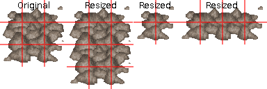
- Consider making your images so that by using individual tiles within image, several sizes can be achieved. While an individual image can often be made look better without the limitation of tiling parts of it at 32 pixel boundaries, resizable ones can add more variety to the maps.
 Example: rubble can be resized in both directions.
Notes
[1] There are valid reasons to break most rules, but do not break a rule unless you understand the reason for it (and, by extension, the reason why it does not apply to your particular image).
[2] Strictly speaking, it's possible to add to the width too, while keeping the tile numbering constant. Don't do that unless you really know what you are doing.
[3] It's also possible to run MapUpdater.class on the relevant maps, either manually, or with a script. If you don't know how to do this, just use 'ant updatemaps'.